Editorial Shoot: Paris in Focus
A city editorial between warm light and sharp contrasts – inspired by Parisian architecture, shadow edges and quiet moments.
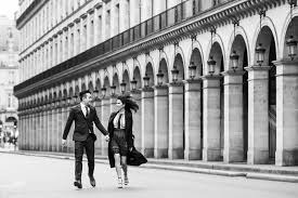
Paris works like a set that's always ready: stone, metal, glass – and movement in between.
This editorial was not about "postcard Paris" but about textures and edges.
Warm light (golden hour) makes skin tones and fabrics glow without looking artificial.
Hard shadows are not a problem here but a design tool: they make the silhouette more graphic and the image more modern.
Styling stays deliberately reduced: clean cuts, calm colors, one look per statement.
Neutrals work particularly well (black, cream, beige) – they let the architecture and details do the talking.
A single accent is enough: lip color, bag, jewelry or a striking layering piece.
Eye-level perspectives and soft background blur give the city vibe its authenticity.
Contrast does not only appear in the image but in the feeling: calm in the middle of speed.
In the end the series counts as a whole: recurring colors, consistent visual language, clear recognition.
KÖ note: if the look stays minimal, the light may be dramatic — that's what makes editorial.